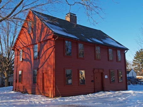
Design snapshot: Seeing red
 Despite what many think, our New England forebears were not afraid of color. Many eighteenth century homes sported bold, single-color exteriors like this one. It works here because the profile and thickness of the siding, trim, windows, and doors are pronounced and varied. Each element casts a distinct and legible shadow, which builds relief into the elevations, without relying on change in color to highlight the different components. A rich, earthy, red such as this contrasts a winter-white and summer-green landscape, while calling attention to itself and the depth of its surfaces. This is no shrinking violet. It’s probably safe to assume the owners aren’t either. A single color applied to a textured exterior can make a striking statement (especially when coupled with a dramatic tree shadow).
by Katie Hutchison for the House Enthusiast