 At first, this place appears like another small park, but it's more to the observant passerby.
The two-foot-thick, dry-laid, granite stone wall gradually steps up a gentle slope, takes a short turn and then steps back down the slope, enclosing an area about the size of a small, residential, in-town lot. Bench-height, large, stone plinths cantilever out from the wall at regular intervals, 10 per long-side. Tall, skinny black locust trees planted within the courtyard dapple the light, and an enormous old maple tree, growing in-line with a row of the benches, shades some of them. It’s peaceful and contemplative, adjacent to a graveyard and a row of antique houses.
It’s the Salem Witch Trials Memorial designed by architect James Cutler and sculptor Maggie Smith of Bainbridge Island, Washington. Each bench represents one of the 20 accused and killed as a result of the witch trials in 1692. Their names, method of execution, and date of death are engraved on the lower right corner of each bench in simple, elegant, capital letters. The deep engravings cast crisp, legible shadows on the massive rough hewn stones.
At the memorial entrance a flush stone threshold is engraved with statements made by the accused, like, “I am wholly innocent of such wickedness.” Some of the quotes trail off under the weight of the stone enclosing walls, possibly signifying how their protestations were ignored. There is no signage announcing the site, just the subtle engravings.
Interestingly, the grave of Judge John Hathorn, whose witchcraft verdict led to the deaths of the accused, lies in the adjacent graveyard, Old Burying Point. Until the Memorial was built in 1992, the victims of the witch trials didn’t have tombstones of their own. Unlike conventional tombstones, these horizontal, six-inch-thick slabs of granite float improbably above the ground, a comment perhaps on the improbable deeds of which the trial victims were accused. The locust trees, it turns out, were selected for the Memorial because the majority of the witch trial victims were hung from such trees, a grisly connection.
Though the bench tombstones can invite an intimacy between a seated visitor and the deceased, sitting on the actual engraving seems disrespectful. I saw one teenager put his foot up on one. This behavioral tension is in many ways another subtle part of the design. How do we as individuals behave within a community?
This quiet memorial creates an inspired place, not just inspired objects, to honor the victims of the witch hysteria. Thankfully these stone benches will be here for years to come, challenging those who encounter them to ponder their meaning and the meaning of those 20 deaths in 1692.
by Katie Hutchison for the House Enthusiast
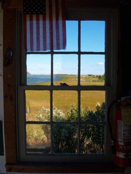
 Click on this photo to see it in the note cards/prints gallery.Last weekend I scanned the vast panorama that surrounded me as I approached the beach; then I peeked into a nearby shed and marveled at this window that captured the setting concisely. I stopped and drank in the multiple framed views composed by the individual window panes. I had just been looking at the same beach grass and body of water seconds before I spotted the shed window, but it hadn’t riveted my attention until I saw it from within the shed, through the frame of the window. What had appeared boundless and somewhat unfathomable when outside was parsed into distinct intelligible moments inside, thanks to the modest double-hung window with six lites over six lites. Surprisingly, this type of parsed view can be far more rewarding than a gaping one.


