 Much of architecture’s artistry comes down to how intersecting elements are handled. The meeting of the roof eave and the roof rake is one of many intersections that good design should take into account.
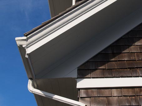
The roof eave, as you likely know, is the horizontal edge of the roof. The roof rake is the sloped edge that travels up a gable, shed, or gambrel end-wall. This photo depicts an extended, closed eave with a level soffit that transitions at the end-wall into an extended, closed rake that follows the roof slope. Did you get that? Basically, a level, boxed-in eave overhang intersects a sloped, boxed-in rake overhang.
The resolution of this intersection is far more elegant than if the level eave soffit had continued past the gable end-wall to the face of the overhanging rake board. That would have resulted in a chunky triangular box, almost ear-like on the gable elevation. This solution is less successful, though, where the gutter meets the crown trim on the rake. Maybe the gutter return should have continued a little farther, so that the crown trim on the rake would have run into and ended at the top of the gutter-line instead.
Why am I telling and showing you this? Because the resolution of this type of detail matters. Attention to such nuance is the crux of comprehensive, thoughtful design.
For more information on designing roof rakes, in particular, check out the December 2007/January 2008 issue of Fine Homebuilding that includes a “Drawing Board” column that I wrote and illustrated on the topic, or click here to see a PDF version of it. Visit the Journal of Light Construction website to see a design column that I wrote and illustrated for them about eaves and rakes in general.
by Katie Hutchison for the House Enthusiast
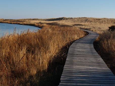 I enjoy the beach in the winter, and a simple boardwalk, like this one, in any season. It gracefully echoes the shoreline that it borders. Barely elevated, it charts a pleasing path. Its destination is just far enough out of sight to keep the curious in pursuit. It invites us to respectfully engage with our natural environment, to appreciate a fragile landscape, while treading lightly. I would follow a boardwalk like this wherever it may lead.


