Design snapshot: Celebrating the edge

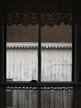
Click on this photo to see it in the note cards/prints gallery.A lace, scalloped-edge valance echoes a unique, scalloped-edge eave on a board-and-batten barn. Ornamentation along an eave or window head can embellish such lines of transition, calling attention to them. Here, both the lace valance and carved eave detail enlist daylight as an accomplice. The partial transparency of the lace softens the window head, while, in bright sun, the shadow-line of the eave carving would highlight the intersection of the roof and wall. Accents such as these enhance edge conditions.

by Katie Hutchison for the House Enthusiast

Design snapshot: A purist shudders over shutters

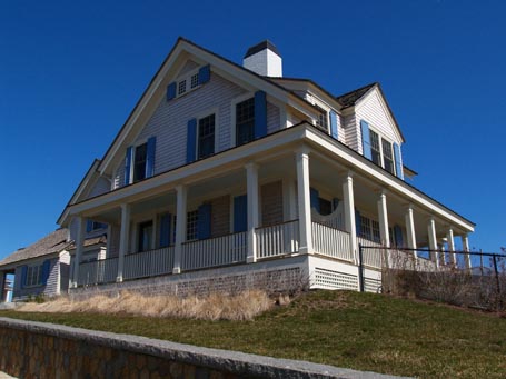
dssshutters.jpgThere’s a lot to like about this house: the porch, massing, materials, palette, chimney, etc. But there’s one repeated element that doesn’t always ring true, the shutters. To be authentic, they need to be plausible. If closed, they should completely cover the opening that they serve. So, if they’re used in pairs, each should be wide enough to cover half of an opening. If only a single shutter serves an opening, it should either be the full opening width or unfold from a bifold to become the full opening width. The shutters on the little gable-top windows look like they’ve been sized appropriately. The single shutters on the double-hung windows below and to the right don’t pass the smell test. The closed pair on the first floor demonstrates how they all should work. If you’re going to use shutters, the sizing may seem like a small detail, but it’s worth getting right.

by Katie Hutchison for the House Enthusiast

Design snapshot: The art of the stone wall

Click on this photo to see it in the note cards/prints gallery.This casually stacked old, field-stone wall ambles across a classic New England farm demarcating fields. The stone selection and placement appears somewhat ad hoc, but beautifully so. Gaps, between smaller rocks toward the top of this jumble and larger rocks beneath them, let daylight penetrate the upper courses, almost cheerfully defying the mass of the wall. It lumbers along performing its function while inspiring awe. It reflects an artful intervention of human will on a weighty natural material. The appeal is almost visceral. For more insight into the art of working with stone take a look at Dan Snow’s In the Company of Stone and Lew French’s Stone by Design.

by Katie Hutchison for the House Enthusiast
Design snapshot: Small house, big windows

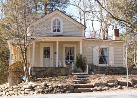
dssbigopensmallbldng.jpgOne-story elements, on the front and both sides of this sweet one-and-one-half-story house, nestle it in the landscape. Though the central gable and side wing are modestly sized, the windows are generously oversized. The first-floor double-hung windows are wider than the entry door and nearly align with the top of it. Their sills are not much above floor level. Even the arch-topped second-floor window maximizes available height. Relatively large windows such as these can create a sense of spaciousness from within small spaces. They can also bring big personality to the curb view.

by Katie Hutchison for the House Enthusiast

Design snapshot: Winter white

dsswinterwhite.jpgA white-on-white palette can look its best in low-angle, winter, morning light. Here clapboards provide a ruled backdrop to trim elements of different depths and profiles that create pleasing accents. Wide corner boards rise to elegant classical capitals which visually support a tall band of frieze trim beneath an overhanging eave cornice. Thick casings and deep sills punctuate each window, while modest crown moldings cap those on the first floor. An off-center entry portico adds a touch of drama. Each crisp, white element works in concert to create a formidable façade.

by Katie Hutchison for the House Enthusiast