 All too often the driveway is a design throwaway. Not this one. Here there are three clearly considered zones: the outer area for passersby; the large, intermediate area for a car; and the more intimate, inner pathway for guests or occupants.
The old, masonry sidewalk and curbstone, which accommodate the passing public, set the scene with authentic, worn, brick and granite. The intermediate zone is defined by a Belgian block border, which frames a pea-stone car pad, and continues off-camera to the left in the form of a Belgian block footpath leading to the front entry. The complementary color of the pea-stone infill provides subtle differentiation in texture and demarcated purpose. Plus, pea stone is more economical than Belgian block. A double row of Belgian block announces a threshold between the car pad and the pea-stone, inner footpath, which is appropriately less formal than the front footpath.
Lush perimeter plantings, below fence height, soften the edges, and progress from the more casual toward the street, to the more refined toward the inner gate. Climbing roses add a splash of color for passersby to enjoy.
Overall, this driveway creates a rich, nuanced experience. As an added perk, the pervious assemblage facilitates drainage in the process.
by Katie Hutchison for House Enthusiast
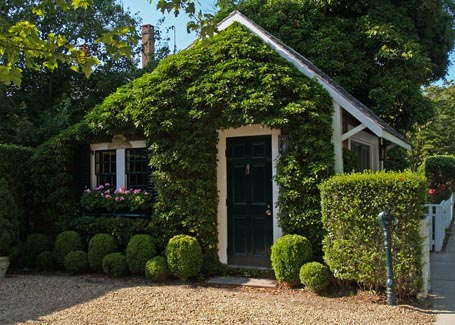
 Yes, this is a different take on “green.” The garage’s dense, vine-covered wall forms one playful side of a courtyard driveway, bound on two other sides by an eave-height hedge. Since it can be a maintenance headache, I wouldn’t recommend growing vines like this against your home, but it’s hard to resist on an outbuilding. Even harder when teamed with window boxes and plump, cantaloupe- and watermelon-shaped boxwoods.


