Design snapshot: Brick might

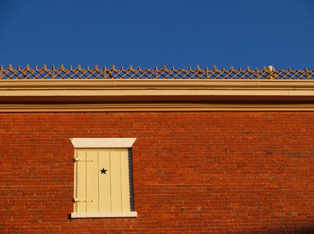
Click on this photo to see it in the KHS photo note cards/prints gallery.I walk past the back of this historic brick building several times a week. So often, in fact, that I sometimes forget how remarkable it is. Warm, old brick, bold, over-hanging eaves, delicate snow guards, spare windows with simple, single-leaf board shutters, sporting minimalist star cut-outs and hard-working strap hinges create a spare, yet distinguished, presence that is quietly stately. It isn’t hard to guess that this is a Federal period building. Materials and their thoughtful arrangement can be powerful communication tools. This building says ‘trust me’.

by Katie Hutchison for House Enthusiast

Design snapshot: Entry Portal & Gate

Some consider fences, arbors, gates, and hedges to be the domain of landscape architecture. To me, more broadly, they’re elements of architecture. As an architect, I’m interested in the design of it all.

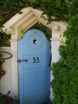
This gated entry portal elegantly draws attention to the threshold between the public way and the private garden and home on the other side of the gated fence.

The exposed rafters (complete with shaped tails) and eave brackets form a small rooflet just wide enough to provide a moment’s shelter and to formally announce the property entrance. The rooflet's detailing complements that of the flanking fence posts and contrasts the simple fence they in turn abut.

The blue gate, with the arched top comfortably below the rooflet, acknowledges that this is an outdoor passageway to a private, but welcoming place. The shape and disposition of the gate’s recessed panels suggest the proportions of an abstract person: head, shoulders, legs. The hardware could even be seen to express arms, the rooflet an implied hat. All of which make it a relatable scale. The peek-a-boo cutout further entices and invites.

An entry portal like this sets the stage for a house and garden which exhibit thoughtful scale, proportion, craftsmanship, and whimsy.

by Katie Hutchison for the House Enthusiast

Design snapshot: Arch-top window tableau

Click on this photo to see it in the KHS photo note cards/prints gallery.I keep coming back to that ochre color. Here it’s a backdrop for three, white-trimmed, arched-top windows amidst a dynamic tableau. This partial elevation of an historic building (c. 1874) captures a similarly appealing play of color, shape, texture, shadow and rhythm as the board-and-batten gable-end design snapshot I posted last week.

The porch eave trim picks up on the arch motif and punctuates it with playful circles à la doughnuts. The horizontal weft of the clapboards is echoed in the strong horizontals of the porch's decorative eave line, in the bold, white, upper band course, and in the bracketed, overhanging eave. The rhythm of the three windows is balanced by the rhythm of the paired, delicate brackets, marching between window beats. A sliver of the burnt-red metal roof at the top of the image suggests how the standing seams set the stage for a vertical emphasis on the roof.

Interestingly, both this design snapshot and last week’s feature train stations. Happily, a house can be informed by a variety of sources. Consider influences beyond dwellings.

by Katie Hutchison for the House Enthusiast

Design snapshot: Board-and-batten gable-end

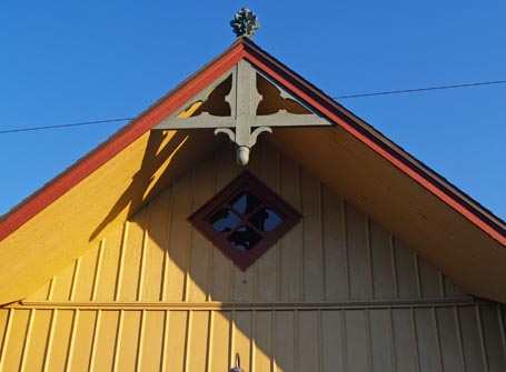
I’m always looking for inspiring exterior gable-end treatments. It’s the board-and-batten siding that initially drew me to this one. Board-and-batten siding harks back to Norway and Sweden and is often spotted in New England on agricultural and Stick-and-Shingle style buildings.

Subtle moves, like increasing the spacing of the upper gable battens from the batten spacing below the demising horizontal trim, add interest to the pattern and differentiate the tippy-top from the middle-top. Both batten  arrangements are centered on the ridge and set up their own rhythm.

In addition to the siding pattern, the diagonally placed square window animates the peak. The finial and large overhanging rake outfitted with a decorative rake truss create compelling shadow lines and shapes. The color scheme of ochre siding, burnt-red trim, and faded-green accents makes for a warm, sunny, yet sophisticated look.

I find the combination of Scandinavian and New England vernacular influences on this gable design irresistible.

by Katie Hutchison for the House Enthusiast

Design snapshot: interior color

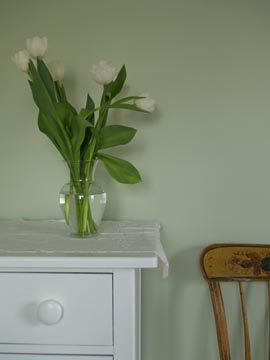
Click on this photo to see it in the KHS photo note cards/prints gallery.A rich color palette can transform an interior. I selected this "Mineral" wall color by C2 Paint to play off muted green tones in mosaic glass tile we chose for an adjacent new bathroom in this island home. The "Milk mustache" C2 Paint we used for the trim also brightened the old bureau shown here and an antique mirror frame above it. 

I don't often mention specific products in these posts, but if you're not familiar with C2 Paint, it's worth a look. The C2 color palette is dreamy and, according to the C2 website, it's created from 16-colorant tints, rather than the more standard 12. C2 offers oversize (18" x 24") sample swatches coated with paint, not ink. Or, if you prefer, you can ask for a 16 oz. Color Sampler to paint a test wall at home. C2 carries a Low-VOC line called "C2 LoVo". Turns out C2 has an unusual business model too; it was recently featured in Inc. magazine.

Disclaimer: I am not affiliated with C2 Paint. Nor do I make any claims to your potential satisfaction or dissatisfaction with C2 Paint.

by Katie Hutchison for House Enthusiast