Design snapshot: Antique entry allure

What is the pull of this entry on me? I’ve been photographing it through the seasons. Is it the subtly muted, worn, putty-colored palette with hints of faded reddish brown, grey and ochre? Is it the way the dappled light dances across it, skipping a beat here and there, lingering long enough to cast a dramatic fence-post shadow? Is it the finely wrought detail of the minute dentils on the pediment, the delicate flutes on the pilasters, the pleasing gentle curve of the crown moldings? Is it the no-nonsense aged granite steps bordering the old brick sidewalk? Is it its direct, bold, symmetrical street-side stance? Yes, it’s all those things and more.

Somehow I feel like I belong to this entry and house as well as so many treasured others I find on the streets of New England. We all belong to these houses, not they to us.

by Katie Hutchison for House Enthusiast

Design snapshot: Barn slider decider

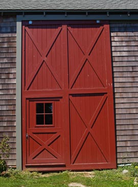
I don’t mean “decider” in the W sense. I mean it in the sense that this barn slider is a game-changing winner among barn sliders.

Love the double-height design, featuring a door within a door. And, yes, despite the lack of clues regarding the scale of the photo, that’s a small-adult-sized passage door, to the left, within the slider. Its height and width most likely determined the slider's overall design. Cleverly, the lites in the passage door pick up on the four-panel configuration of the slider.

Plus, the slider's four cross braces do their job efficiently and in true barn style. Red paint finishes off a truly satisfying design.

What fun it would be to adapt a slider like this to a residential application, like a breezeway or three-season area.

Find more examples and thoughts about barn slider adaptations here, here, and here

by Katie Hutchison for House Enthusiast

Design snapshot: Distinctive bay window with a view

A bay window like this embellishes an exterior elevation and creates an appealing nook on the interior from which to enjoy a stunning view. 

This one-story addition has the look of a beautifully enclosed porch. The cross-braced, half-wall suggests a guard rail, now infilled with vertical boards. The overall assembly has porchiness.

Corbelling beneath the bay softens the transition from the brick wall below to the projecting bay above, known as an oriel. There's something organic about how this oriel bulges out from the plane of the adjacent walls. It offers distinctive personality, bonus space, and a clear view beyond the confines of the primary structure. It's a keeper.

Read more about bays in an article I wrote and illustrated a few years ago for The Journal of Light Construction, available on the JLC website.

by Katie Hutchison for House Enthusiast
Design snapshot: Shapely balustrade

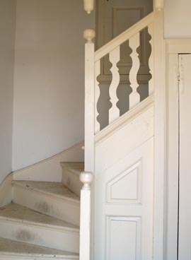
White-on-white vignettes animated by profile, texture, and depth appeal to my sense of "complex order".  Winifred Gallagher writes in House Thinking that, according to architect Grant Hildebrand and his colleagues at the University of Washington, "complex order" is a factor among several which “enhance our experience of home”.  Plus, the interlocking positive/negative space created by this shapely balustrade, which serves an antique winding stair in New England, brings the work of Carl Larsson to mind.

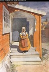
For those not familiar with Larsson, he was a Swedish water-color artist whose paintings of family life within his cherished home Little Hyttnas are much celebrated today.  I admire both his water colors and the home he lovingly created in Sundborn.

by Carl LarssonThe Larsson entry-scene painting (shown here as a thumbnail) at Little Hyttnas captures his affinity for cut-out shapes and the intimate spaces they frame and enliven.  Though a rusty orange color ties subject to building to earth, I would argue that this work would still be spatially intriguing if rendered in shades of white.

I offer the winding stair and balustrade as case and point.

by Katie Hutchison for House Enthusiast

Design snapshot: An entry door with a touch of mystery

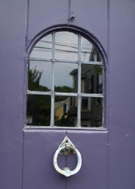
The design, material, and color of this detail within an antique entry door readily draw my attention. The v-groove planks, along with the beaded, arched-top, peak-a-boo window, and leaded lites punctuated with a ring-shaped, iron knocker are at once simple, elegant and intriguing design elements. The combination of deep-purple paint, gray metalwork and reflective, black glass enhance the door’s enticing, yet mildly foreboding, vibe – a captivating mix, especially in October. 

You can’t help but wonder what similarly beguiling architectural details might be found on the other side of this door. If only I could wrangle an invitation to find out. Perhaps I’m not too old for trick-or-treating… O.K., I am.

by Katie Hutchison for House Enthusiast