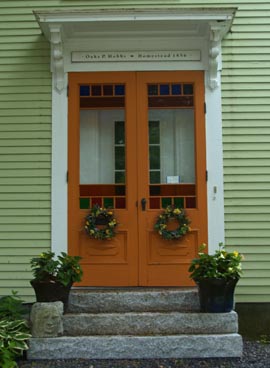
Design snapshot: Vestige of Victorian era entry

The color combination of orange doors trimmed in white within pale, green, exterior walls drew me eye to this tableau. (See House Enthusiast logo/button colors.) Three granite risers and an elegantly bracketed door visor set off the striking doors, which feature square and rectangular panes of colored glass bordering clear lites. Bottom wooden panels, picture-framed by moldings and featuring applied panels with diamond-shaped accents, further render these doors unique.

Though they may have once functioned as primary entry doors, they now appear to be acting as storm doors or secondary doors. Today, immediately inside them, a newer, single, French door sits in what is presumably an insulated wall. This is a very clever way to preserve an antique entry while simultaneously reducing air infiltration. It’s win-win; such a solution retains architectural character and improves energy efficiency. If you’re renovating an older home, keep an approach like this in mind in lieu of replacing unique, antique doors with contemporary alternatives.

by Katie Hutchison for House Enthusiast

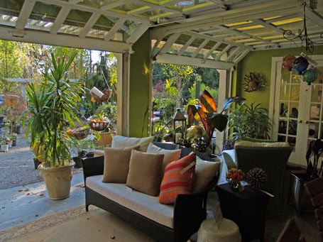
Design snapshot: Barn three-season bonus

A barn is a natural to adapt to a three-season space. This barn in Connecticut is home to Elise, Landscapes & Nursery and contains their three-season-like showroom and design offices. Overhead garage-style doors open the sitting space showroom to the container-garden patio. A slate floor extends a couple of feet outside of the barn door openings and transitions to pea stone at the same level, which helps unite the two spaces. A fresh, green, interior wall color also ties inside to outside. Wicker furniture, dressed with throw pills and positioned on area rugs, sets a homey stage (and showroom).

Outside, an arbor visor extends across the two barn door openings, softening the transition between inside and out. The folks at Elise have carved out space on either end of the three-season-like showroom for their offices. Both flanking spaces take advantage of French doors and interior windows to borrow from the adjacent indoor/outdoor vibe in the showroom.

For an example of a smaller three-season living space, check out the Manchester Garage/Garden Room I designed. Also, if you’re thinking of adapting/creating your own three-season space, you may be in need of some oversize doors, so take a look at the “Designing doors for large openings” Drawing Board column I wrote for Fine Homebuilding here. Issue #198, October/November 2008. Reprinted with permission copyright 2008, The Taunton Press, Inc.

by Katie Hutchison for House Enthusiast and SquareOne.

Design snapshot: Alley gateway

Passersby simply can’t help but glimpse down this alley. It’s human nature to scan our environment to note differentiation. It’s how we orient ourselves, and in an evolutionary sense, it’s probably one way we seek to protect ourselves. Walk along a streetscape of densely sited buildings, which suggest a wall of sorts fronting a sidewalk, and you’ll find yourself noticing the spaces in between, becoming curious about them, in part because they’re different.

The treatment of this alley elegantly feeds and thwarts such curiosity. The wrought-iron gateway defines a visually permeable and gracious threshold. A potted plant in front of the left-hand gate adds a touch of domesticity, its leaves playing off the scrolling, swirling patterns of the ironwork. Its placement also conveys that the right-hand gate is the operable one, should we gain permission to enter. The elliptical moon gate design sharpens our focus on what lies yonder, temptingly close, but off limits to the uninvited. Sunlight beyond the adjacent building’s shadow beckons. What appears to be an elegant parking court, edged by a fence brimming with blossoming flowers, and a brick residence perhaps adapted from a utilitarian use teases our natural inquisitiveness. Yet we stand in the public realm while the gate marks the transition to the private realm beyond. 

This alley gateway brilliantly tempts and denies. Read more about “Transitioning with exterior gateways” in my Drawing Board column for Fine Homebuilding here. Issue #218, April/May 2011. Reprinted with permission copyright 2011, The Taunton Press, Inc.

by Katie Hutchison for House Enthusiast
Design snapshot: Slatted shutters sentiment

When fully operable, exterior window shutters can be pragmatic; close them to protect windows from inclement weather (or to protect privacy) and open them to invite daylight and view. But, many find shutters to be nostalgic, unnecessary, and/or difficult to maintain. Naturally, they can be. In fact, some of the best are.

I’ve written before (here) about sizing shutters appropriately, so they fit the windows they serve.  But, until now, I haven’t commented much on shutter design. We tend to think of shutters as having horizontal slats, sloped to shed water while also offering sun and wind protection. Sometimes, they’re paneled, sporting small decorative cut-outs (like here). Other times, such as in this photo, they playfully concede that their purpose is not to protect, but to delight.

Here, white, flat-stock slatted shutters echo the design of the white, slatted fence, bordering part of the yard. Despite there being little reason to close such permeable shutters, they’re sized to fit the windows they serve, which, as you can imagine, I applaud. Also, opting for a single shutter per window is a more dynamic choice than selecting a pair of smaller shutters to flank a window, which is a more static arrangement. Both windows are too close to their respective corners for the shutters to hang corner-side, so they each hang inbound and thus mirror each other. The effect bestows an otherwise simple elevation with the drama of symmetry.

The rose bush below, looking as if it might aspire to climb, invites the viewer to ponder whether the shutter design is somewhat trellis-like, as well. A sunny color palette reinforces the sunny tableau. Yes, these shutters are nostalgic, seemingly unnecessary, and perhaps a mild maintenance nuisance, but they’re also a design delight.

by Katie Hutchison for House Enthusiast

Design snapshot: Fence/wall/planter

So which is it? A fence, a wall, or a planter? Fences are generally light-weight, thin, somewhat ephemeral demarcations between property or grounds. Walls tend to be thicker, more solid, and often seemingly permanent dividers. Planters are typically low, decorative, planted containers.

This creative composition successfully blends and morphs the common attributes of all three constructs. Like a fence, it’s built of light-weight wood, and it bounds a property. Like a wall, it has thick mass, demonstrated by its capacity to store lengths of firewood. Like a planter, it brims with decorative plantings.

Using clapboards, a customary exterior wall cladding, as fencing helps this feature blur its function. So, too, does the height of the planter, which is almost roof-like. An opaque door, adjacent to the firewood and beneath the planter, further suggests that the feature is a wall, since the door most likely conceals space constructed to store tools, yard equipment, and/or furnishings. Beyond it and the planter, I suspect the assemblage narrows to a more fence-like thickness, though we can't be sure since its face remains in the plane of the door. Had that portion stepped back to the rear plane of the firewood compartment, it would have disrupted the contiguous fence/wall appearance.

When I’m scouting for “design snapshots”, this type of hybrid, multi-function creation, which also happens to be aesthetically delightful, is one of my favorite kinds of finds.

by Katie Hutchison for House Enthusiast