Design snapshot: Wrap it to go

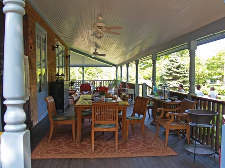
This is a porch, yet a room. Outdoors, yet in. It’s a great example of a deep, wrap-round porch which invites use. I’d estimate that it’s twelve-feet deep – twice the minimum recommended depth in A Pattern Language pattern #167: Six-foot balcony.

The semi-enclosing guardrail, periodic turned posts, and gently sloped bead-board ceiling all provide comfortable shelter, while the long, wrapping, open expanse welcomes daylight, breezes, and view. Furnishing the porch for sitting and dining, complete with finished sideboards, serving tables, and a rug, greatly expands and diversifies the available living space.

If I could, I’d wrap this gem up and take it home with me. Short of that, we can borrow from its example. Learn more about integral, wrapping porches in my recent Drawing Board column for Fine Homebuilding’s annual HOUSES issue. Click here for a PDF of the column. "Design an integral porch" by Katie Hutchison, Issue #227, Spring/Summer 2012. Reprinted with permission copyright 2012, The Taunton Press, Inc. Read another porch paradigm “Design snapshot”, too.

by Katie Hutchison for House Enthusiast

Design snapshot: The Emperor Penguin of cottages

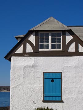
Sometimes a building speaks to us loud and clear, but we’re not exactly sure why its call holds such a grip on us. Such was the case with this white-stuccoed cottage with a hipped gable, partial half-timbering, and centered, ocean-blue shutter. It instantly made me smile, much the way catching glimpse of a favorite dog breed will.

In my family, we tend to assign the characteristics of much-revered animals to much-revered people and objects. There doesn’t seem to be an English word for this, not “anthropomorphize” but, perhaps, “animalpomorphize” – though dictionary.com tells me this isn’t a word.

In any case, this little structure reminds me of an Emperor Penguin. Have you seen the March of the Penguins movie? Plus, a PBS Nature episode about animal babies recently aired, and there, again, were charming, waddling Emperor Penguins. Somehow, I see in this hipped gable, two window eyes in a stout white body of an Emperor Penguin. The half-timbering even reminds me of the contrasting coloring of the Emperor Penguin face. In addition, the location and disposition of the blue shutter reminds me of where an Emperor Penguin shelters her or his newborn, in front, down between her or his feet.

But if you’re not one for “animalpomorphization”, this cottage also passes my Recipe for Architectural Charm. Does it pass yours?

by Katie Hutchison for House Enthusiast

Design snapshot: Shingled swordfish at sea

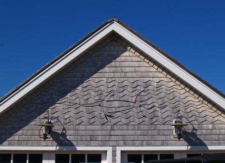
I know having favorites is generally frowned upon, but I happily admit that white-cedar shingles are my favorite building material. They’re versatile, durable, practical, and, in the right hands, can be shaped into graphic, artful, and/or fun creations. I like new, white-cedar shingles, the color of warm sand, and old, white-cedar shingles, weathered silver grey. I like them in all manner of courses: standard, alternating, scalloped, diamond-shaped, staggered, domed, chamfered, wavy, and pictorial; you name it.

This shingled swordfish, in among shingled waves, edged by a shingled rake, adorns a modest garage which happens to border a beachfront property. I salute the inspired team who commissioned, designed, and created this scene, whoever they may be. Well done!

by Katie Hutchison for House Enthusiast
Design snapshot: Distinctive Dutch door

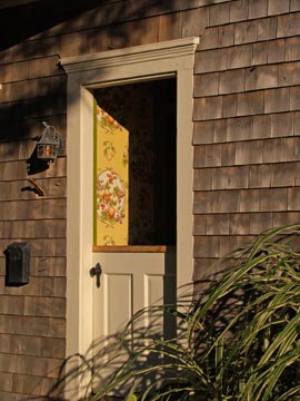
The Dutch door is one of architecture’s more versatile elements. It’s both door and window. We often associate Dutch doors with barns, as in the case of Mr. Ed. But a Dutch door is a great feature in a dwelling, too. It allows us to control access between spaces by closing the lower half, and to invite view and air flow by opening the upper half.

This Dutch door is a front entrance. The closed lower half signals that passersby aren’t encouraged to enter uninvited, but the open upper half communicates that the occupants, who are willing to share an enticing view of the entry hall’s elegant wallpaper, might be open to receiving guests.

Perhaps it’s the contrast of the stark, walled exterior and the hint of a vibrant, lively interior that drew my eye to this entry. Few other door types offer the opportunity for such a provocative juxtaposition. This one beautifully balances enticement and deterrent.

For more about Dutch doors read the Design snapshot: Entry duality, too.

by Katie Hutchison for House Enthusiast
Design snapshot: Positive space

Somewhere I have a winter picture of this little house with its assorted outbuildings, but this summer shot is a warm reminder on a cold day.

The tiny outbuilding to the right looks to be about five feet from the back corner of the petite main house, which appears to border a courtyard of sorts, edged by yet another modest outbuilding. Together, these diminutive structures shape a mini compound. Their arrangement carves out several engaging outdoor rooms within the lot.

Some might refer to such outdoor rooms as negative spaces between structures. To me, they’re positive spaces -- the reward of mindful siting.

Check out another “Design snapshot” about cottage placemaking here.

by Katie Hutchison for House Enthusiast