Design snapshot: Arbor ambiguities

"Enclosure" and "shelter" are nuanced words. Some enclosures are more porous than others. Some shelters are more sheltering than others. It seems we need more words, different words to describe the many varying degrees of enclosure and shelter that we find and create in the world.

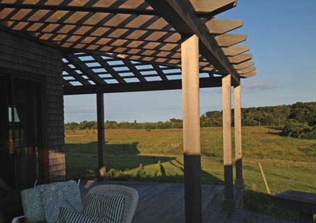
An arbor, attached porch-like to a home, can offer an airy enclosure or shelter that treads lightly and doesn't impose. It creates an ambiguous indoor/outdoor space. If it were planted with a grape vine or wisteria (as in this Ask Katie example), the additional shade and denser boundary would feel more sheltering and perhaps softer. Bare bones as it is, here, the arbor creates interesting shadows and patterns that delineate and suggest a porous enclosure and shelter. Without the arbor transition between house and deck, the inside and outside realms would be all the more separate.

by Katie Hutchison for House Enthusiast

Design snapshot: Sunken front garden

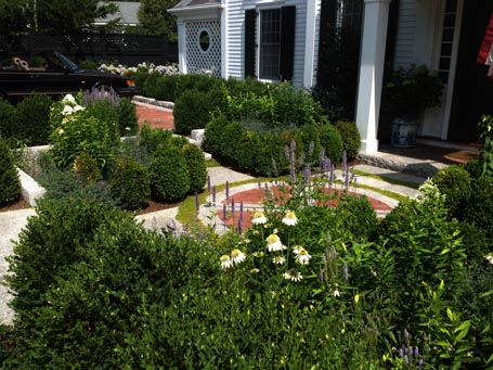
In a village setting like this one, the distance from the front sidewalk to the front entry is often shallow. In this example, there's approximately twenty feet between the public way and the entry door. Here, a slightly sunken, formal garden orchestrates the transition from public to private with the aid of an elegant brick and granite geometric design.

Centered on the front door, a hardscape pattern suggesting a compass dial is set within a larger square layout, slightly recessed from the public way and the entry stoop. Quadrants of plantings, including tightly spaced boxwood accented with splashes of white and purple flowers make for an intimate yet structured room-like outdoor space -- which feels quite separate from the granite-edged brick parking pads at street level off to either side of the garden.

This landscape design elegantly finesses an entry sequence and parking in tight quarters.

by Katie Hutchison for House Enthusiast

Design snapshot: Bodacious barge and eave boards

If you've ever been to the West Tisbury Farmers' Market on Martha's Vineyard, then you're familiar with the Grange Hall. Saturday, while others were browsing the Market's fresh produce, herbs, flowers, and artisan fare, I was snapping photos of the Market's mainstay, the Grange Hall.

The c. 1859 timber-frame Hall boasts bold, carved, rake and eave boards. The simple cut-out pattern casts a strong geometric shadow, calling attention to and celebrating the roof's edge. I was taken by a similarly dynamic carved roof treatment on another agrarian building in this earlier Design snapshot. In fact, I'm often attracted to decorative roof detailing, as in the lead photo for my upcoming fine-art photography exhibit.

Thoughtful accents like these team with natural light to great design effect.

by Katie Hutchison for House Enthusiast
Design snapshot: Outdoor room

This is one of the many reasons I love outbuildings; they make outdoor rooms like this possible. I took this shot from a driveway between the corner of a house off-camera to the left and a slightly offset outbuilding to the right. The narrow passage compresses entry into the outdoor room which the buildings and landscaping frame. The vine-covered tree and its offspring of sorts, the twig bench, flanked on one side by a blossoming topiary and by climbing roses on the other become the focal point for those en route around the corner to whatever enticement awaits. I hope it includes another equally charming boundary.

by Katie Hutchison for House Enthusiast

Design snapshot: Petite, yellow house

“Adorable,” I kept marveling after discovering this little, yellow house. I found myself using the same animated tone of voice as I use when discussing my parents’ miniature, wire-haired dachshund. I suppose it’s my tone of voice for all things miniature and adorable.

In the photo above, I included a partial view of the neighboring natural-finish, white-cedar shingle house, which is by no means large, as a scale reference for the diminutive yellow house. Dividing a home’s volume into smaller components is a strategy I often recommend for reducing the apparent scale of larger homes. But, here, an already smaller home has divided its volume into smaller components, which results in it seeming even smaller, and, yes, even more adorable. Wouldn’t it be delightful if whoever lives here owned a “Kite Blue” MINI Cooper and parked it out front for my next photo op?!

The attention to detail in the porch brackets, chamfered posts, staggered shingle coursing on the gable end which wraps the side walls, and the angled boards infilling the ends of the porch roof only tips the scale further on the adorable scale. So do the yellow and white color scheme and the seemingly large (for such a petite house) double-hung windows.

Show me the keys; the yellow house would be a dreamy vacation rental. (Did I mention it's on Martha's Vineyard?)

by Katie Hutchison for House Enthusiast