Design snapshot: Gallery wall

One of the first features we noticed in our new (to us) home is a long interior wall bordering the open living/dining area. One look and my husband said to me in passing, "Here's your gallery wall." So true. It was practically begging for a changing display of my fine-art photography.

Having discovered the simple and elegant Gallery System Art Displays at the Old Sculpin Gallery (where I exhibit my photos on Martha's Vineyard in the summer), I got in touch with the distributor to order the flexible system for our home gallery. Switching out the photo "shows" is a breeze and a fun way to freshen the look of the space. (Above is my boat-detail "show".)

Compliments from a visiting interior designer friend, Deborah Emery of Emery Design Associates LLC based in New York City, inspired me to share our gallery wall with like-minded House Enthusiasts who might want to create their own changeable gallery.

One word of caution: when installing the system, use a real level -- not the iPhone level, like this casual installer did.

by Katie Hutchison for House Enthusiast

Design snapshot: Framed view

I've written before here and here about the power of the framed view. One of those earlier examples highlighted how a framed view parses an expanse into something more manageable, more easily appreciated. The other commented on a framed view's power to tempt and deny our curiosity.

In this example, the frame of the building sidewall, pergola with its marching posts, intermediate planters, and bordering hedge create an anticipated procession which promises the ultimate reward of a desirable view (should we be lucky enough to be invited to proceed.) No matter that the bulkhead would literally block the procession, the visual axis shoots right past it. The fountain, it seems to me, should be sited further beyond the bulkhead (perhaps in place of the small distant topiary) where sky and water would abut it rather than brick and shingle.

Interestingly, the entry landing steps and guard rail suggest a parallel line of travel to the framed view. Here, in fact, you could argue that the framed view out ranks the entry. Or perhaps it's augmenting it.

by Katie Hutchison for House Enthusiast

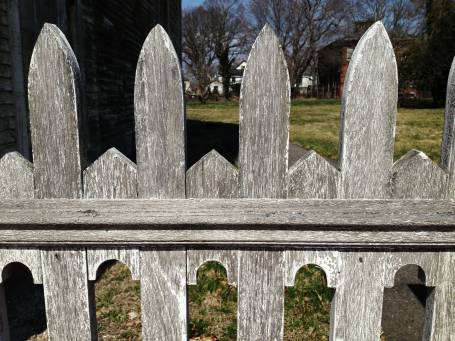
Design snapshot: Weathered fence geometry

Good fences make good neighbors and good "Design snapshot" subjects. This one is a great example of the power of negative space. But since I've never been a big fan of the term "negative space" (due to its negative connotations), let's think of this fence more in terms of figure and ground.

Here, the fence rail and posts act as the "figure" and the space shaped in between and around them act as the "ground". In this design, both figure and ground are engaged distinct shapes which create a lively border. The rough silver-grey cedar finish contrasts the crisp geometry of the figure and ground, which makes this fence all the more "Design snapshot" worthy. Sure, if it were painted, it would still be striking, but weathered grey, it's stunning.

by Katie Hutchison for House Enthusiast

Design snapshot: Summerhouse porch setup

I know I'm jumping the gun, but whenever March gives us a sunny weekend in the upper 40s, like this one, I can't help but anticipate spring.

One of the first signs of spring around my parents' house has long been the sweeping out and setting up of their summerhouse -- a little shed a few feet from the side door to their house. I've shared their summerhouse with House Enthusiasts several times over the years -- in a video and in a house-garden primer.

Here, the summerhouse porch is set with a diminutive bench and chair amidst the long, quiet shadows of late winter -- and, dare I say, early spring -- which linger across the robin's-egg blue floorboards. A flower pot beneath the bench patiently waits to be planted, perhaps with something spring-like, possibly pansies.

To me, this scene is peacefully bursting with charming possibly. Spring can't be far off now.

by Katie Hutchison for House Enthusiast
Design snapshot: Painted-lady cottage trim

Many of the "painted ladies" stick-and-shingle cottages, like this one, at the Oak Bluffs camp-meeting grounds on Martha's Vineyard offer playful trim combinations of contrasting color and carvings. Here, red, flowery barge boards and white, balcony skirt trim cast sharp, graphic shadows on the cottage's shingle backdrop.

The brightly trimmed gothic-revival style window appears ready to blast upward -- held at bay by the bleeding-heart balcony trim, pointing in the opposite direction. The staggered-height horizontal members in the guard rail reinforce the play between opposing up and down forces.

It's a dynamic composition eager to please appreciative passersby.

Read more about the Vineyard camp-meeting grounds here and here.

by Katie Hutchison for House Enthusiast