Not-so-big houses by Katie Hutchison Studio

Manchester Garage/Garden Room

A prospective client who's a fan of the The Not So Big House book series by Sarah Susanka recently emailed me and asked if I could fill him in on my experience designing and building with not-so-big design concepts. I thought I'd share with you a lightly edited version of my response to him.

I wrote:

I have long endorsed the not-so-big design philosophy which prioritizes quality and livability over quantity. Here are some links to a few of my projects which I believe exemplify not-so-big design. 

The first is the Manchester Garage/Garden Room which is a small out-building I designed to accommodate outdoor living three-seasons of the year and a car in the winter. Multi-purpose design is a fundamental principle of the not-so-big canon. Design that maximizes versatility, comfort and fun is not-so big.

The Reading Kitchen & Bath Renovation/Addition reconceives how space is used, to better apportion it and appropriately augment it. Re-imagining flow and use to enhance livability is essential to not-so-big design. This project involved relocating the kitchen to a new addition and changing entry points and room function to support the new kitchen location, such that the owners could better access and enjoy natural light and their wooded, rear yard.

The Salem Antique: Kitchen Renovation maximizes a small space's potential while maintaining a spacious, coherent feel. Incorporating boat-like efficiency to make the most out of limited space is a hallmark of not-so-big design. 

Not-so-big doesn't necessarily mean small; it means smaller. The West Tisbury House is designed to reduce its scale, such that it reads as an assemblage of elements, as if it evolved over time. Incorporating wrapping single-story features helps to ground it and minimize its visual impact on the site. From the interior, the collection of gathered spaces offer spatial differentiation, with some spaces feeling more open and others more nestled. Thoughtful massing and spatial differentiation can reduce apparent scale, while encouraging livability. 

I could probably continue to reference the not-so-big design ideas behind most of the projects in my portfolio, but I'll stop there for now.

by Katie Hutchison for House Enthusiast.

The simple saltbox

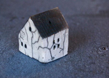
For Christmas I received this delightful, little, ceramic house ornament from a friend. You can’t tell from the photo above, but it’s only 1 1/8” wide x 1 ¼” deep x 1 ½” tall. It has a matte-black, textured roof; shiny-white, glazed walls, accented by grey crackles resulting from raku firing; and recessed rectangular windows – some grey, some white. It’s easy to rotate and work in the palm of your hand in the manner of worry beads. It’s a charming charm.

It also satisfies my Recipe for Architectural Charm. Well, mostly. Since it isn’t sited, it cannot exhibit an engaged relationship with landscape. It, however, possesses all of the other required ingredients: grounding rooflines, legible massing, simple color palette and harmonious materiality, and thoughtful details.

It’s a saltbox, pure and simple -- a form to which I and so many others intuitively respond. I wonder what parts of our brains or chemistry are triggered by the saltbox form? What else similarly triggers them? Maybe if we knew, we could more readily create other forms or spaces that likewise appeal.

I’ve written about the influence of architecture/environment/space on us, our bodies and minds, before here and here. If you’re interested in acquiring the little, ceramic house for yourself or a friend, find it on etsy. If you have a hankering to see a saltbox-inspired addition I designed, check-out the Reading, Mass. Kitchen & Bath Renovation/Addition.

by Katie Hutchison for House Enthusiast

Timeless reveries in interiors art

Edward Hopper c. 1951 Rooms by the Sea; image courtesy of Artinvest2000

We know what we like when we see it, but don’t always know why we like what we like.  In The Architecture of Happiness Alain de Botton ventures a theory to explain this attachment to an object, an artwork, or a building.  He writes, “To describe a building as beautiful…suggests more than a mere aesthetic fondness; it implies an attraction to the particular way of life this structure is promoting through its roof, door handles, window frames, staircase and furnishings. A feeling of beauty is a sign that we have come upon a material articulation of certain of our ideas of a good life.”  I would amend de Botton’s theory only slightly, to suggest that what we recognize as beautiful taps into our reveries of a desired life, both remembered and anticipated.

I have repeatedly found this “material articulation” in paintings, prints, digital montages, and photographs of interiors.  The domestic realm as depicted by Pieter de Hooch and Johannes Vermeer in the 17th century, Vilhelm Hammershoi toward the end of the 19th century and the beginning of the 20th, Edward Hopper in the mid-century, and Jeffrey Becton, Alanna Fagan, and Abelardo Morell today capture something universal: the dreamy longing we feel for a home of an idealized past rife with imagined possibilities. It's a life full of enticement, prospect, refuge, even hints of potential peril or mystery -- the same characteristics that define the best residential architecture.

de Hooch and Vermeer’s nostalgic anticipation

Pieter de Hooch c. 1658-1660 A Mother and Child with Its Head in Her Lap (A Mother’s Duty); image courtesy of Lines and Colors

In “A Mother and Child with Its Head in Her Lap (A Mother’s Duty)” c. 1658-1660 Dutch painter Pieter de Hooch sets a layered stage of everyday home life in which the mother and child are almost incidental to the scene.  They are busy, faces turned, at nearly middle distance, involved in the child’s grooming in the soft, warm light of a tall window off to the right.  Our attention, like that of the dog sitting with its back to us, is drawn past them and the shelter of the built-in bed in the front, tiled room, through the open door and interior side-lite, toward the direct light cast on the floor by the half-open Dutch door washed in daylight, and the transom window above it, to the bucolic realm implied beyond. 

De Hooch invites us to enter a familiar scene, depicting an incidental moment in which a child or an imagined self is cared for, and to pass by, en route to something perhaps more tantalizing and unknown beyond it.  Is this a memory or a dream of what may come?  Or both? 

Though it’s a 17th century domicile, it’s surprisingly modern in its relative sparseness, muted color palette, and spaciousness.  There is enough absence in material and detail to make room for us to inhabit the tableau.  It entices viewers of today on a journey through the time of the painting and the time of their own imaginings.

Johannes Vermeer c. 1662-65 The Music Lesson; image courtesy of Wikimedia Commons

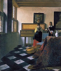
Johannes Vermeer, only a few years younger than de Hooch, and traveling the same Dutch terrain, painted “The Music Lesson” in 1662-65.  Here, too, the figures are off to the right, toward the background with heads turned.  Even in the mirror above the virginals, the reflection of the pupil shows her looking off in a yet another direction.  Though the figures are involved with a less banal task than personal grooming, they are absorbed in an activity secondary to the viewers’ attention.  We are individually allotted space in the foreground to the left, to enter the frame, pad across the elegant stone floor, pass the lush tapestry and base viol, and approach the far window to gaze on the world below from the lofty comfort of a well-heeled abode. 

Do the musicians know we are there, casually listening in, visiting the past while sharing the subjects’ domain, only to lose ourselves in reveries of what is beyond? 

As with the de Hooch interior, Vermeer’s is surprisingly modern.  The furnishings are bold and uncluttered, while the sense of volume is great.  More intensely colorful than the de Hooch interior, “The Music Lesson” projects the vibrant immediacy of a dream that’s convincingly real.  The unexpected modernity allows us easy access to the vignette.

Hammershoi’s century-old enticement

Vilhelm Hammershoi c. 1905 White Doors; image courtesy of WikiGallery

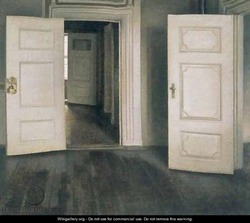
“White Doors” c. 1905 by Vilhelm Hammershoi of Denmark departs with the convention of occupying interiors with people at all.  As a result, it’s even easier to imagine ourselves inhabiting this painting.  A series of wooden, white doorways direct the viewer from stage right deep into the painting, toward a sliver of daylight entering through a distant window.  The device of drawing an occupant on an axis toward a vista through doorways of adjoining rooms is know as enfilade in architectural terms.  It’s a dynamic pattern meant to create a sense of anticipation.  Here, doors are thrown ajar as if beckoning us through this hazy interior world, nearly drained of color and devoid of furnishings.  The subdued tones enhance the mystery of what may lie ahead, and contribute to a sense of suspense.  Though more than one hundred years old, this painting’s spare, muted, quiet sensibility feels unmistakably modern.  It’s practically cinematic.

Hopper’s prospect and refuge

Edward Hopper c. 1951 Rooms by the Sea; image courtesy of Artinvest2000

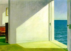
Edward Hopper’s “Rooms by the Sea” strikes a similarly intriguing chord.  This c. 1951 work by the American painter is recognizable to most.  I have, admittedly, on several occasions glued photos of myself into copies of it, such that I’m seated to the right on the threshold with legs dangling seaward and my head either turned over my shoulder toward the viewer or facing out to sea.  That’s how much I’ve wanted to be part of “Rooms by the Sea” – part of this nostalgic, yet otherworldly place, among familiar domestic trappings poised inexplicably out to sea.  The desire to be safe inside, amidst the sun’s glow, while tempting the vast potential just outside the door can be understood as the desire for “refuge and prospect”.  In House Thinking, Winifred Gallagher notes that houses which balance (among other things) opportunities for refuge and prospect “enhance our experience of home”, according to architect Grant Hildebrand and his colleagues at the University of Washington.  “Rooms by the Sea” satisfies our individual yearnings to take refuge in our past and to thrill at the prospect of our future.

contemporary reflections of memory and expectation

Maine artist Jeffrey Becton picks up on this theme in his 21st century digital montage “On the Cusp”.  In Becton’s image, the sea in the doorway outside the comforts of a well-worn interior is not illuminated on a bright, clear day, but a hazy, rough one.  Perhaps what lies beyond is “peril”, another of the characteristics identified by Grant Hildebrand et al in House Thinking as a vital ingredient which, when deftly suggested, enriches our experience of home.  A less abstract contemporary image by Becton “Upstairs Hall” recalls Hammershoi’s “White Doors”, moving the viewer through adjacent spaces toward a bright window, here, a reflected one.

Alanna Fagan Upstairs At Margaret’s; image courtesy of Alanna Fagan's website

“Upstairs At Margaret’s” a recent painting by Connecticut artist Alanna Fagan reintroduces the spatial depth of Hammershoi’s “White Doors”.  Fagan uses a color palette more akin to Hopper’s in “Rooms by the Sea”, and light cast on the floor like de Hooch’s “A Mother and Child with Its Head in Her Lap” draws viewers toward a distant mirror as in Becton’s “Upstairs Hall”.  The mirror in Fagan’s painting reflects an illuminated wall and perhaps another opening, while reflecting the emotion of a memory or expectation.

Abelardo Morell c. 1994 The Sea in the Attic; image courtesy of Abelardo Morell's website

“The Sea in the Attic” c. 1994 by Cuban-born Abelardo Morell of Massachusetts, in which an attic room acts as a camera obscura for the seascape beyond it, elicits a dreamy state of mind: part recollection part fantasy.  The upside down and backwards distant vista intermingles with the present attic to dizzying effect.  Refuge and prospect intertwine.  The potential peril of losing one’s bearings is countered by the recognizable planes of floor, wall and ceiling and the familiar treatment of wood planks.  One can’t help but wonder what dreamscape may wait behind the attic doors. 

recollected and conjured

The journey through domestic interiors from de Hooch, in the 17th century, to Morell, today, meanders through recollected and conjured rooms tinged with comfort, tranquility, potential and aspiration.  To me, they are the “material articulation” of a desired life.

by Katie Hutchison for House Enthusiast