Salem Window Box Competition 2012

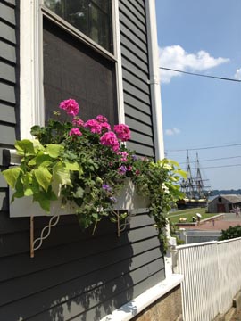
I can spot a winner. True, former winners often repeat, but still, I called this one early in the summer before it  blossomed into its full award-winning glory.

See all of this year's winners in the Salem Gazette (print edition), including the box above at 188 Derby Street created by Claire Bailey. Well done. I've featured the fruits of Claire's labor in previous years, as in this design snapshot from the House Enthusiast archives. Another stunning entry from a previous year resembles this year's third-place finisher in the Business Window Box category. (Not sure if they're the same location.)

Congrats to those who repeated and to those who secured first-time wins. Victory certainly smells sweet.

by Katie Hutchison for House Enthusiast

Web tour: Maine Home + Design: Craft in architecture

Crafted detail on the West Tisbury HouseMaine architect Will Winkelman writes in the August issue of Maine Home + Design about the essential collaboration between craftspeople and architects in creating well-crafted homes.

Winkelman notes that craft "can add an entirely new dimension." Indeed. He writes, "The addition of a layer of craft to a project furthers the project's narrative, giving more depth and character, furthering the story of its 'place'." How true.

It's well-crafted details and moments that speak to our desire to live a well-crafted life. This is the sentiment behind Alain de Botton's The Architecture of Happiness, too. Quality craftsmanship can be perceived as a form of beauty and as such can reflect back to us the kind of life we desire, where such care, thoughtfulness and artistry are at home. It's why the collaboration between craftsperson and architect is vital to creating a home that resonates with those who encounter it.

When a home sets my heart aflutter, it's often the craftsmanship of the architecture that's sparked my reaction. Let's continue to promote craft in the craft of architecture.

by Katie Hutchison for House Enthusiast

Design snapshot: Lighthouse window hoodie

Few of us will ever have the opportunity to live in a lighthouse. Nevertheless, we can translate some simple lighthouse window design lessons to our own humble abodes.

The gabled hood on this arched-topped louvered window is a beautiful bevy of contrasts: angled/curved, black/white, and opaque/porous. It's also a harmonious pair of elements working in concert to control the elements: roof for shelter, louvers for ventilation.

Keep contrasts and complements in mind when designing your own windows. Make them lighthouse worthy.

by Katie Hutchison for House Enthusiast

Desgin snapshot: When hedging helps

Hedges have a bit of a bad rap in the residential-architecture world. They're often employed to hide things: condensers, vents, trash enclosures, and other unsightly appurtenances. Or they're used to shield private life from prying eyes. But hedges can augment, even enhance, design attributes, rather than merely mitigate design challenges.

This tight, neatly-trimmed hedge cozies up to the porch rail it wraps. It helps to nest the porch without overwhelming it. The trick is to keep a hedge like this from brimming the rail, or worse, topping it. At this height, it offers security, a pillowed embrace.

All hail the hedge.

by Katie Hutchison for House Enthusiast

Design snapshot: Sunken front garden

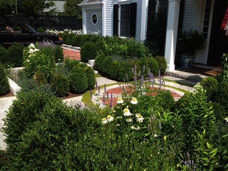
In a village setting like this one, the distance from the front sidewalk to the front entry is often shallow. In this example, there's approximately twenty feet between the public way and the entry door. Here, a slightly sunken, formal garden orchestrates the transition from public to private with the aid of an elegant brick and granite geometric design.

Centered on the front door, a hardscape pattern suggesting a compass dial is set within a larger square layout, slightly recessed from the public way and the entry stoop. Quadrants of plantings, including tightly spaced boxwood accented with splashes of white and purple flowers make for an intimate yet structured room-like outdoor space -- which feels quite separate from the granite-edged brick parking pads at street level off to either side of the garden.

This landscape design elegantly finesses an entry sequence and parking in tight quarters.

by Katie Hutchison for House Enthusiast