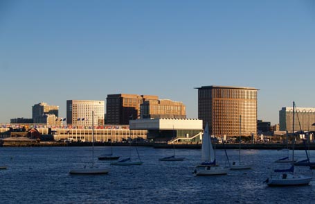
 I have mixed feelings about the Institute of Contemporary Art in Boston. You may have seen all the press that it received when the new building, designed by Diller Scofidio + Renfro, opened last winter. Most photos of it are from the water, like the one above, where the cantilevered upper floors and canted sculptural media center are shown to their best advantage. Unfortunately it has a dreadful, blank, street presence; it’s pushed far back from the road, beyond a seemingly endless asphalt parking lot.
Shortly after it opened, I visited the museum with some fellow architects. As we toured the various exhibit spaces, we enjoyed bandying about stream-of-conscious criticism. We stopped sniping though when we stepped into the digital media center. It’s the space with computer stations serving stadium-style seating that projects below the cantilever and culminates in an enormous glass window, canted downward to frame a spectacular view of the water, not the shoreline. It was exhilarating. Later, in search of the restrooms we stumbled upon the Founders Gallery at the north end of the fourth floor exhibit space that runs the width of the building with a glass wall in the long dimension parallel to the water view. There you can stand above the water and take in the stunning panorama, as if the museum is merely setting the stage for the real show, the art of the contemporary cityscape.
But I digress. I went to the ICA most recently to tour their Design Life Now exhibit which was organized by the Cooper Hewitt, National Design Museum and runs through January 6, 2008. Upon entering the exhibit, wall graphics proclaim, “This survey of design in the U.S. presents the best work from 2003-2006.” Really? I’d have been more comfortable if the featured projects had been described as “exemplary modern work” rather than “best work”. Anyway, I found plenty of things to admire, but little architecture that caught my fancy.
share
I was drawn to several of the displays about graphic design and designers who it seems address in two dimensions many of the same design issues that architects explore in three dimensions. Balance, order, form, sequence, color, texture, pattern, contrast, craftsmanship, and meaning are relevant to both fields. One display about graphics and technology highlights Speak Up, the popular blog that features discussions related to graphic design. A built-in monitor shares Speak Up live with museum goers while wall graphics emphasize some relevant previous excerpts from the site. One from Pittsburgh graphic designer Andrew Twigg says, “Perhaps the problem with design at this juncture has less to do with all the things we whine about and has more to do with our failure to educate everyone else. Maybe it’s time we stop talking to ourselves and start talking to someone else.” Touché. That’s what museum exhibits and web postings like his and mine are for.
functional art
Among some of the usual big-names like Apple, NIKE, and PIXAR were some lesser known designers like Alison Berger Glassworks. At least she’s lesser known to me. Her pendant light fixture titled Glass Slide Chandelier is an intriguing collection of small, bronze-framed, hanging, glass slides of black and white images portraying architecture, industrial subjects, and portraits displayed around a large white rectangular light box. It’s a contemporary twist on the traditional crystal chandelier, dispersing light and artistry.
practical whimsy
Though I’m somewhat oblivious to fashion design, with little interest beyond my embarrassing Project Runway addiction, I found Tom Scott’s knitwear display compelling. His sweaters, shrugs, and such are convertible, multi-function, practical whimsies, my favorite kind of design. The muted colors and minimal, organic forms are a pleasure. If he were an architect, I’m sure I’d enjoy his buildings.
simple solution
My taste for clarity found me saluting the packaging and label design of Deborah Adler’s pharmacy bottles for Target. ClearRxSM Prescription System was the result of Adler’s Master’s thesis at the School of Visual Arts in New York. After her grandmother took her grandfather’s medication by accident, Adler saw room for improvement in the design of standard pill bottles. Her initial concepts included a color-coded label system on larger D-shaped bottles with plenty of room for label text and a slot for additional prescription information. Once she brought her idea to Target to develop further, she teamed with industrial designer Klaus Rosburg to arrive at the final bottle design that includes a top-down, child –resistant cap, plenty of flat space for a label, and color-coded rings to identify each family member’s medication. Hers is a prime example of how a good design solution to an everyday problem can simplify life while making it safer.
make
I was thrilled to discover a display about Make magazine where today’s do-it-yourself trend meets technology junkies and other willing tinkerers. Apparently the February 2005 premier issue included detailed instruction for a savvy enthusiast to create “kiteborne aerial photography” or KAP. No joke. The ICA displays several examples of the resulting fun photography that can be taken from 25 to 250 feet above, thanks to the camera-carrying kites. Some basic components used to create the aerial device were included in the exhibit: like popsicle sticks, Silly Putty, rubber bands, and a disposable camera, among other slightly more sophisticated things. It didn’t look like you’d need to be exceptionally handy to put it together, just patient, inquisitive, and adventuresome. I may have to give this a try.
explore
The only architecture in the exhibit that resonated with me was the exhibit design itself. Michael Meredith, Associate Professor of Architecture, Harvard University Graduate School of Design, created a straightforward yet playful environment for the many divergent subjects. The exhibit is essentially comprised of a series of parallel, thick (approximately 30 inch) white walls that house built-in objects, and objects displayed in oversized punched (open or glassed-in) rectangular voids where they can be appreciated from two sides. Museum goers circulate primarily down the middle, perpendicular to the white walls, through rectangular openings of staggered width that create a false perspective of sorts. I heard one attendee refer to the passage (and visual) routes as “tunnels”. Which they are in one sense at least; toward the north there is natural light at the end of a “tunnel” that frames a view of the harbor seen through the Founders Gallery. The sizeable openings invite light and air through the space that’s easy to navigate and enjoy.
visit
I’ve only touched on a few of the designs and designers featured in the exhibit. You may find the work of others that I overlooked worthy of your attention. There’s only one way to find out; check it out for yourself.

