 Click on this photo to see it in the note cards/prints gallery.It’s easy to overlook something exquisite or noteworthy when it’s familiar. It’s worth training your eye, though, to stop and recognize good design at work. So I’m launching a new category with this posting in which I’ll share a “Design snapshot”.
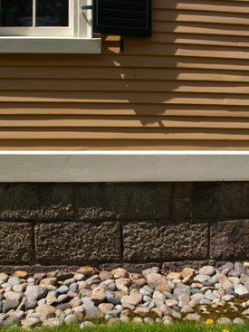
The photo to the left captures part of the everyday architectural landscape in historic Salem, Massachusetts. The materials of this antique building elegantly perform their function while creating a richly textured composition.
The rectangular, coursed granite of the foundation holds the building up, and the apple-sized, perimeter stones facilitate drainage. In the process, each contrasts aesthetically with the other. One is linear, methodically stacked, and heavy; the other is rounded, informally piled, and light enough to collect and carry. The cream-colored, thick, bevel-edged, wooden, “water table” trim that runs above the stone foundation, and outside of it, provides a functional transition between the inset foundation below and the water-shedding clapboards above. It also provides a visual transition between the large, mottled, grey stones and the narrow, golden, hand-hewn wood siding. As the building grows taller above grade, windows provide view and light; their deep, thick sills shed water away from the siding. In addition, the windows punctuate the composition with contrasting transparency and cream-colored, wooden elements.
This age-old building’s individual components work together to perform and delight.
by Katie Hutchison for the House Enthusiast

