Design snapshot: A view with windows

dssessexbarn2.jpgI’m captivated by a beautiful barn. It’s the rhythm of the windows and doors, along with the rich red-and-white color palette, that caught my eye on this one in Essex, Mass. at Cogswell’s Grant.

The small white windows march along a little higgledy-piggledy. They’re mounted in the stables at horse-scale, meaning the horses have a great view, but my nose would only barely clear the sill. The doors in between are sized for people, of course. So both those tending the stables and their charges are represented in the architecture. This supports the theory that the best elevations express something about those within.

The little wooden visors with brackets over the windows and doors provide shade and shadow, as well as visual interest. Part of their appeal it the hint of formality that they suggest, something we don’t generally expect from an outbuilding. Such contrast is often vital to an engaging design. The large expanse of red clapboards beautifully offsets the line of dancing windows and doors, trimmed in white. The resulting elevation makes for a happy building. How lucky those horses are.

by Katie Hutchison for the House Enthusiast

Design snapshot: Classical comments

Click on this photo to see it in the note cards/prints gallery.A detailed look at a wood, fluted, Roman Doric pilaster in Salem, Mass. reveals the artistry of a classical mainstay.

The shadows created in the concave, vertical flutes are an appealing contrast to the horizontal shadows below them created by the deeply profiled trim known as the “Attic base”. Evidence of the craftsman’s hand is clearly visible in the worked wood. The careful miter joint, where the trim wraps above the base plinth, reminds us that this pilaster is made of assembled parts. Their proportions are thoughtfully considered. The flutes are all wider then the space in between them, known as fillets, and together divide the surface that comprises the shaft into a three-dimensional, patterned form which otherwise, if left plain, would appear flat and dull. The profiled trim just above the base plinth gracefully enables the transition from the narrow upper shaft to the wider plinth that visually supports the pilaster.

Every element of this detail contributes to the overall elegant effect. You needn't be a classicist to appreciate it.

by Katie Hutchison for the House Enthusiast

Design snapshot: Marblehead work building works

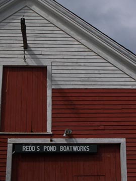
dssredds.jpgThis little boat shed captures the appeal of the New England vernacular. Its seeming simplicity is largely the result of good design. Like an Olympic athlete who’s mastered her sport, making it look almost effortless and easy, Redd’s Pond Boatworks makes a hard-working elevation look simple.

The composition of the two openings within the gable-end elevation sets the stage for contrast: triangle vs. rectangle, small vs. large, centered vs. offset, top vs. base. The proximity of the smaller, upper door opening to the larger door opening below links one to the other visually, with only a single red clapboard between their trim. The location of the larger door off to one side is balanced by the smaller, upper door centered within the gable.

It’s the use of color, though, that may seem the most striking. The white-on-white of the upper clapboards and trim calls attention to their dimension, depth, and texture. The red doors and lower red clapboards dramatically offset the white, while accenting the transition from the upper-middle part of the elevation to the top.

The construction of the different components further plays on contrast for their appeal. The vertical square-edge boards of both doors, bound by trim, graphically juxtapose the horizontal clapboards that surround them. The angle of the overhanging rake trim (along the roof) adds another dynamic set of graphic shadow lines.

The sign, of course, contributes to the building’s irresistibility with its matter-of-fact white capital letters hovering over the red doors of Redd’s. I imagine the visual pun was intended, yet another well-conceived detail on this deceptively simple charmer.

by Katie Hutchison for the House Enthusiast

Design snapshot: Vineyard elemental outdoor fireplace

phfp.jpg

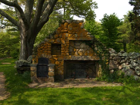
Never before have I seen an outdoor fireplace as in touch with its surroundings as this rugged, earthy creation at the Polly Hill Arboretum on Martha’s Vineyard. It’s right at home near an enormous shading tree. Following the tree’s lead, the fieldstone base grows up from its roots to form a trunk-like chimney. It then rambles off to the side to create a stone wall that shapes a generous outdoor room under the tree’s canopy.

Though lichen and vine-covered by nature, its construction attests to the human touch. Stacked rounded stones, horizontal granite lintels, and a careful arch reveal a craftsman’s skill. An iron oven, sweeping fireplace crane, and anchor-style andirons combine utility with appealing artistry. The recessed rectangular niches above the firebox contrast with the organic overall shape of the fireplace, further indicating the organizing touch of the craftsman. Perhaps these niches were once display spaces, or, more likely, they contained shelves for storage and maybe even cabinet-style doors.

This seeming ruin still “functions” I’m told. Clearly it does; it functions to inspire us with what nature and mankind can conspire to create.

by Katie Hutchison for the House Enthusiast
Design snapshot: Salem historic texture

Click on this photo to see it in the note cards/prints gallery.It’s easy to overlook something exquisite or noteworthy when it’s familiar. It’s worth training your eye, though, to stop and recognize good design at work. So I’m launching a new category with this posting in which I’ll share a “Design snapshot”.

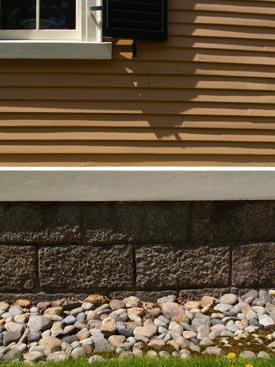
The photo to the left captures part of the everyday architectural landscape in historic Salem, Massachusetts. The materials of this antique building elegantly perform their function while creating a richly textured composition.

The rectangular, coursed granite of the foundation holds the building up, and the apple-sized, perimeter stones facilitate drainage. In the process, each contrasts aesthetically with the other. One is linear, methodically stacked, and heavy; the other is rounded, informally piled, and light enough to collect and carry. The cream-colored, thick, bevel-edged, wooden, “water table” trim that runs above the stone foundation, and outside of it, provides a functional transition between the inset foundation below and the water-shedding clapboards above. It also provides a visual transition between the large, mottled, grey stones and the narrow, golden, hand-hewn wood siding. As the building grows taller above grade, windows provide view and light; their deep, thick sills shed water away from the siding. In addition, the windows punctuate the composition with contrasting transparency and cream-colored, wooden elements.

This age-old building’s individual components work together to perform and delight.

by Katie Hutchison for the House Enthusiast